Probability: A Sci-Fi Display Font That Elevates Digital Branding
I was deep into finalizing the hero section of a new landing page for a boutique digital coaching brand—clean, intentional, and future-forward—when I opened Probability in my font tester. The moment it rendered over a subtle gradient background, something clicked: this wasn’t just another decorative display font. It had presence, precision, and just enough tech-infused character to feel both human and intelligent.
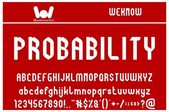
Probability is a techno-themed sci-fi display font—sharp, geometric, and rhythmically asymmetrical. Its letterforms carry subtle circuit-board echoes and modular weight shifts, like typography designed by an AI that studied Bauhaus and cyberpunk cinema. But crucially, it doesn’t sacrifice legibility for flair. The uppercase ‘A’, ‘M’, and ‘R’ have clean terminals; counters are open and consistent; spacing feels calibrated—not tight, not loose—just right for high-impact web use.
In practice, I used Probability for the primary headline (“Clarity Starts Here”) and the subheading tagline (“A 6-week digital coaching journey”). On desktop, it anchored the layout with quiet authority. On mobile, I switched to a slightly smaller size and increased line height by 1.3—no kerning adjustments needed. It held up beautifully against a soft video background, especially with a light semi-transparent overlay. No halo effect, no pixelation—even at 48px on Safari iOS.
What makes Probability work so well in real digital layouts isn’t just its aesthetic—it’s how it behaves. As a display font, it’s built for emphasis, not endurance. That means it shines in hero titles, campaign banners, course module headers, and logo lockups—but it’s not meant for body copy, navigation labels, or dense product descriptions. I paired it with Inter (a neutral, highly readable sans serif) for all paragraph text and UI elements. The contrast was immediate: Probability set the tone; Inter kept the experience grounded and accessible.
I also tested it in several other contexts across the same project:
- Landing page CTA buttons: Used Probability at 20px for “Start Your Journey”—tight but legible, especially with sufficient padding and a contrasting background color.
- Section dividers: Applied it as a centered, all-caps label above testimonials (“What Clients Say”). It added visual punctuation without overwhelming.
- Branded social graphics: Exported as SVG for Instagram carousels—crisp at any scale, no font-substitution fallbacks required.
- Dark-mode variant: Tested over charcoal (#1e1e1e) with white text—no loss of definition, thanks to generous x-height and balanced stroke contrast.
Readability remains strong across devices—but only when used intentionally. On small screens, I avoided using Probability below 24px for headings, and never for interactive elements under 16px (like filter tags or micro-copy). For image overlays, I always applied a subtle text shadow (1px black at 30% opacity) to ensure contrast met WCAG AA standards—especially important for users with low vision or viewing on glossy screens.
Font pairing matters—and Probability rewards thoughtful contrast. With its angular, forward-leaning energy, it pairs best with typefaces that offer calm balance: a warm sans serif like Poppins or a refined serif like Crimson Pro for editorial sections. I avoided pairing it with other display fonts (no double drama), script fonts (too much personality clash), or ultra-thin weights (it needs breathing room). In one variation, I even tried it alongside a monospace for code snippets—surprisingly cohesive, given Probability’s grid-aligned DNA.
Before deploying, I checked the technical details carefully. Probability comes with OpenType features, multiple weights (Light, Regular, Bold), and robust Latin character support—including accented characters used in Spanish, French, and German. No Cyrillic or Arabic, so I’d avoid it for multilingual sites needing full global coverage. It’s available as WOFF2 for fast web loading, and the license explicitly permits self-hosted use on client websites, SaaS dashboards, and digital brand kits—no subscription required. That’s a big plus for freelancers and agencies building long-term assets.
Where Probability truly stands out is in shaping first impressions. On a portfolio site for a generative artist, it gave the “Featured Work” banner a tactile, almost holographic quality. For a synthwave-inspired music course landing page, it reinforced theme without leaning into cliché. And on a minimalist e-commerce banner for limited-edition design tools, it made “Launch Edition” feel like an event—not just a sale.
That said, it’s not universal. I wouldn’t reach for Probability for a law firm’s website, a healthcare blog, or a children’s learning app—its voice is too specific. But for brands rooted in innovation, digital creativity, speculative design, or forward-thinking education? It adds authenticity and distinction you can’t fake with generic system fonts.
One last note: always test with real content—not just “Lorem ipsum” or “The quick brown fox.” I swapped in actual client headlines and watched how letter combinations flowed: “AI-powered”, “Next-gen”, “Interface Design”. Probability handled ligatures and tall ascenders gracefully. No awkward collisions. No hidden alternates needed—just clean, confident rendering.
If you’re selecting a display font to define your digital brand’s tone—something that signals thoughtfulness, futurism, and craftsmanship—Probability earns its place in your toolkit. Not as background noise, but as a deliberate, functional accent: precise where it needs to be, expressive where it counts, and always serving the user’s understanding before the designer’s ego.